Read time: 5 minutes
When was the last time you thought about your website’s information architecture?
If you haven’t, don’t worry, as you’re not alone.
For many website owners, the furthest many of them think about regarding their site’s information architecture (IA) is what’s shown on their main navigation. And even then, they aren’t thinking about it strategically, as they pull inspiration from some of their favorite sites.
Information architecture plays a key role in your overall site. It’s what helps guide designs, development, and content writing to ensure your site is maximized for efficiency.
Without it, you may be putting together “puzzle pieces” that don’t necessarily fit. Sure, you could put together a website, but it may not be built in the best interest of your users or stakeholders.
Having a strong IA ensures you are building your website with “strong bones” and a strategic foundation, and it can really pay dividends when you’re looking to hit your marketing or sales goals (depending on your business needs, of course).
But to properly implement it, you first need to understand what it is and how to strategically think about it.
What is Information Architecture?

Used to help establish the overall structure of a website, information architecture (IA) allows users to map out exactly how they want the website to flow from the homepage to the blog and everything in between.
But it’s more than just picking a specific order of pages. For many people in web development and design, the information architecture process is a lot more arduous and detailed.
To start, much of the process is built around information gathering:
What do others in our industry do? What are some of the tendencies of our audience? Are there things that need to be included?
These are just some of the questions people in IA are asking themselves as they begin the process of creating a wireframe.
Wireframe: a two-dimensional illustration of a page’s interface that specifically focuses on space allocation and prioritization of content, functionalities available, and intended behaviors. (Credit: Usability.gov)
Although some of the questions may vary depending on what your needs may be, the result is the same:
Getting the most information possible to ensure your wireframe is properly structured with your audience in mind.
For us, we do this through our Ecosystem Analysis, which gives us an opportunity to really understand our client’s industry, competitors, audience, and overall expectations.
But regardless of what process you follow to gather this info, this work is critical to a productive information architecture process, and it can really help guide you on what and where you want to set up current pages.
Putting It Together

So after you’ve gathered all of your information, what do you do now?
It’s time to start building your sitemap and wireframes — or what we affectionately call your “WireMap.”
Using the information you gathered earlier in the process, you can craft your WireMap based on how you feel like your audience may choose to navigate through your website.
Some websites may want their users to quickly find the information they are looking for on their site, so they opt for a simple one-pager with anchor links in the navigation bringing them down to that specific page on the site.
Other websites can be more complex with the number of pages they have, so they may choose to have a main navigation bar listing out the important pages of their site, while a utility navigation on the upper right corner houses the more minor pages.
As you can see by just those two examples, there are numerous ways to go about this process. Granted, you’ll need to work within the confines of usability, accessibility, industry standards, goals, and audience preference (just to name a few), but those “guard rails” can actually help make the process of creating a sitemap and wireframe that much easier.
And if you need an example of this thought process, a great one would be our website’s homepage.
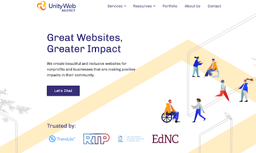
We’re fortunate enough to not have too many pages that aren’t a blog, so we can consolidate our main pages to just one navigation.
Now our big goals for the website, and the homepage in particular, are to keep bounce rate down and improve pages per session. And as for those metrics, they are driven because of what we know about our clients and audience, as well as their tendencies around web development and design.
As you scroll down, you’ll notice that along with having the option to view our services or resources in the navigation up top, you’ll also see options to click into those same services and resources on the homepage itself.
We know many people won’t even think to look at services, resources, or the navigation as a whole, so we make sure that those same options are also shown on the homepage itself.
Now we can go much further our analysis, but we’ll stop there (at least for right now) to emphasize an important point:
Many of our decisions around the homepage are driven by industry standards and audience habits.
For you to have a successful website, that’s the same mindset you need to take into account when you are working on your own information architecture and wireframe.
By doing so, you ensure that your site is set up for success and brings you that much closer to your business goals, whatever that may be.